Just the paper collection is going away soon! Beautiful Friendship was the first paper collection featured in the Seasonal Expressions 2 Idea Book. It had a lovely color scheme of pinks, light yellow and a bold Sapphire Blue. I loved all the floral patterns and the tea cups were a fun addition. I'm sharing a layout I did some time ago and a new layout I created recently revisiting those "Tea-riffic" images from the coordinating complements.
These papers are still so gorgeous to me...I may need to get another pack before they are retired! Be sure to get products from this collection before August 31st. Thanks for stopping by!
Showing posts with label beautiful friendship. Show all posts
Friday, August 10, 2018
Thursday, July 5, 2018
Convention 2018
I have just recently attended a most unforgettable event. As a consultant for over 11 years, I have never attended an annual corporate convention. This year it was held so close to home that I could not pass up the opportunity!
I knew that I was in for a treat, but still was caught up in such a whirlwind of excitement, entertainment, information, and inspiration! I think that now almost a week after completion I am finally digesting it all.
The opening entertainment was all set to a Greatest Showman theme, which happened to be my favorite movie of 2017! Our Founder and CEO Jeanette Lynton welcomed us all and boy what a fantastic kick off to this party it was! I can't quite share everything from this extraordinary event yet, you will have to wait unfortunately. I can, however share with you the cards I created to trade with other attendees. I made a total of 7 different designs.
For these first three cards I felt they were a good representation of who I am and where I'm from. The card on the left is a cricut cut of some mountains with a sun burst pattern of Fresh Air papers. This is to represent that convention was held at Red Rock Hotel and Casino. If attendees were lucky there hotel room had a view of the gorgeous Red Rock mountains in the distance. One of our favorite nearby places to hike. The cards in the center feature a succulent flower, some of my favorites and a chalkboard technique as my "normal" job is instructing in a classroom. There are two versions only because I ran out of ribbon! Finally, the card on the right is a darling bicycle. I enjoy riding my cruiser with the family on vacations or for a more grueling ride my husband and I venture out on various trails on our mountain bikes.
These next cards are all about my passion for Close To My Heart. I love creating with my own hands, making beautiful art and preserving my family memories. Some cards were just a standard card, some contained a bookmark, one of them was a holder for the bookmark and the last card at first look appears normal, but fold up like an easel to display the best sentiment ever! {Look for that stamp in August!}
The theme of this entire convention was CREATE! I love the meaning of it too, check it out~
C~ community
R~ renew
E~ elevate
A~ achieve
T~ tell your story
E~ empower
Good reminders of why I chose to represent this company 11 years ago and hope to continue for many more!
I knew that I was in for a treat, but still was caught up in such a whirlwind of excitement, entertainment, information, and inspiration! I think that now almost a week after completion I am finally digesting it all.
The opening entertainment was all set to a Greatest Showman theme, which happened to be my favorite movie of 2017! Our Founder and CEO Jeanette Lynton welcomed us all and boy what a fantastic kick off to this party it was! I can't quite share everything from this extraordinary event yet, you will have to wait unfortunately. I can, however share with you the cards I created to trade with other attendees. I made a total of 7 different designs.
For these first three cards I felt they were a good representation of who I am and where I'm from. The card on the left is a cricut cut of some mountains with a sun burst pattern of Fresh Air papers. This is to represent that convention was held at Red Rock Hotel and Casino. If attendees were lucky there hotel room had a view of the gorgeous Red Rock mountains in the distance. One of our favorite nearby places to hike. The cards in the center feature a succulent flower, some of my favorites and a chalkboard technique as my "normal" job is instructing in a classroom. There are two versions only because I ran out of ribbon! Finally, the card on the right is a darling bicycle. I enjoy riding my cruiser with the family on vacations or for a more grueling ride my husband and I venture out on various trails on our mountain bikes.
These next cards are all about my passion for Close To My Heart. I love creating with my own hands, making beautiful art and preserving my family memories. Some cards were just a standard card, some contained a bookmark, one of them was a holder for the bookmark and the last card at first look appears normal, but fold up like an easel to display the best sentiment ever! {Look for that stamp in August!}
The theme of this entire convention was CREATE! I love the meaning of it too, check it out~
C~ community
R~ renew
E~ elevate
A~ achieve
T~ tell your story
E~ empower
Good reminders of why I chose to represent this company 11 years ago and hope to continue for many more!
Wednesday, June 20, 2018
Bushel and a Peck
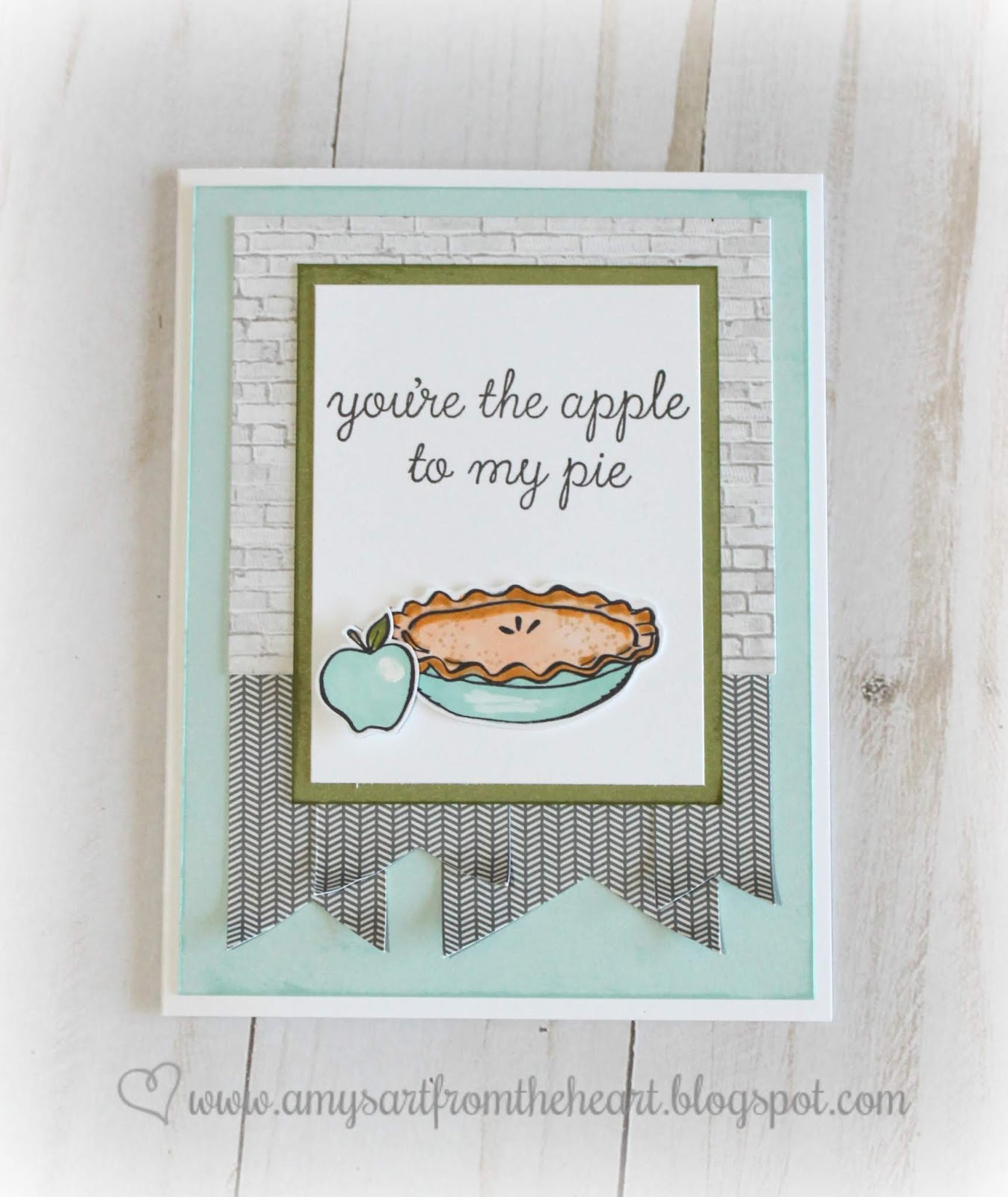
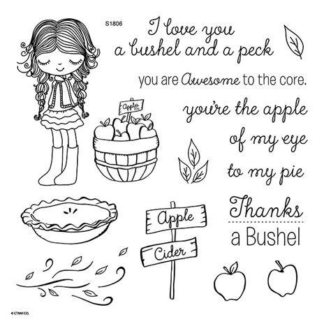
Did you get the stamp of the month for June yet? Oh, she is a cutie and the pie is delicious! You will have so much fun using the images from this set and will find the perfect sentiment as well. Take a look at all the different uses I've found.
I mixed all sorts of the new papers with just a little bit of some old papers with cardstock. I found that the images looked wonderful using both alcohol markers and a waterbrush pen with ink pad. You could also use watercolor pencils, whatever you wish to experiment with. {Just remember to stamp in archival or memento black ink so there will be no bleeding.}
I used some Beautiful Friendship paper for this one. I stayed a little stronger on the pink side of it.
How about a pop of light glacier blue with some brick pattern from the Documented collection! Cute!
Here are some more documented papers, but what's that? Did I sneak in a stamp for the August Stamp of the Month! {I love crafting}
This background paper looks like watercolor which I could have done myself, but the older Chelsea Gardens paper is already done for me. So soft and pretty with those vibrant green apples and leaves!
I love the pop of red on the subtle blue and green, plus that lacy ribbon gives it a vintage vibe.
{papers: Fresh Air, Documented & Postcard Perfect}
Here is the Beautiful Friendship paper again, but it really comes to life when popped with the canary yellow!
An old wood grain paper really makes these red apples pop, but all together it is a nice simple thank you card!
Lastly, when paired with the Fresh Air papers she is ready for Fall! I hope I remember to get this stamp out again when creating some autumn inspired cards. That means if you don't get it now, you won't have it at all for your fall projects either!
Shop online here. Be sure to check out all the specials being offered this month so that you can reach your total to get this stamp set for only $5.
I mixed all sorts of the new papers with just a little bit of some old papers with cardstock. I found that the images looked wonderful using both alcohol markers and a waterbrush pen with ink pad. You could also use watercolor pencils, whatever you wish to experiment with. {Just remember to stamp in archival or memento black ink so there will be no bleeding.}
I used some Beautiful Friendship paper for this one. I stayed a little stronger on the pink side of it.
How about a pop of light glacier blue with some brick pattern from the Documented collection! Cute!
Here are some more documented papers, but what's that? Did I sneak in a stamp for the August Stamp of the Month! {I love crafting}
This background paper looks like watercolor which I could have done myself, but the older Chelsea Gardens paper is already done for me. So soft and pretty with those vibrant green apples and leaves!
I love the pop of red on the subtle blue and green, plus that lacy ribbon gives it a vintage vibe.
{papers: Fresh Air, Documented & Postcard Perfect}
Here is the Beautiful Friendship paper again, but it really comes to life when popped with the canary yellow!
An old wood grain paper really makes these red apples pop, but all together it is a nice simple thank you card!
Lastly, when paired with the Fresh Air papers she is ready for Fall! I hope I remember to get this stamp out again when creating some autumn inspired cards. That means if you don't get it now, you won't have it at all for your fall projects either!
Shop online here. Be sure to check out all the specials being offered this month so that you can reach your total to get this stamp set for only $5.
Subscribe to:
Posts (Atom)